UX & UI Design · 2023 · Conceptual Brief
Role:
UX & UI Designer
Tools:
Figma
OVERVIEW
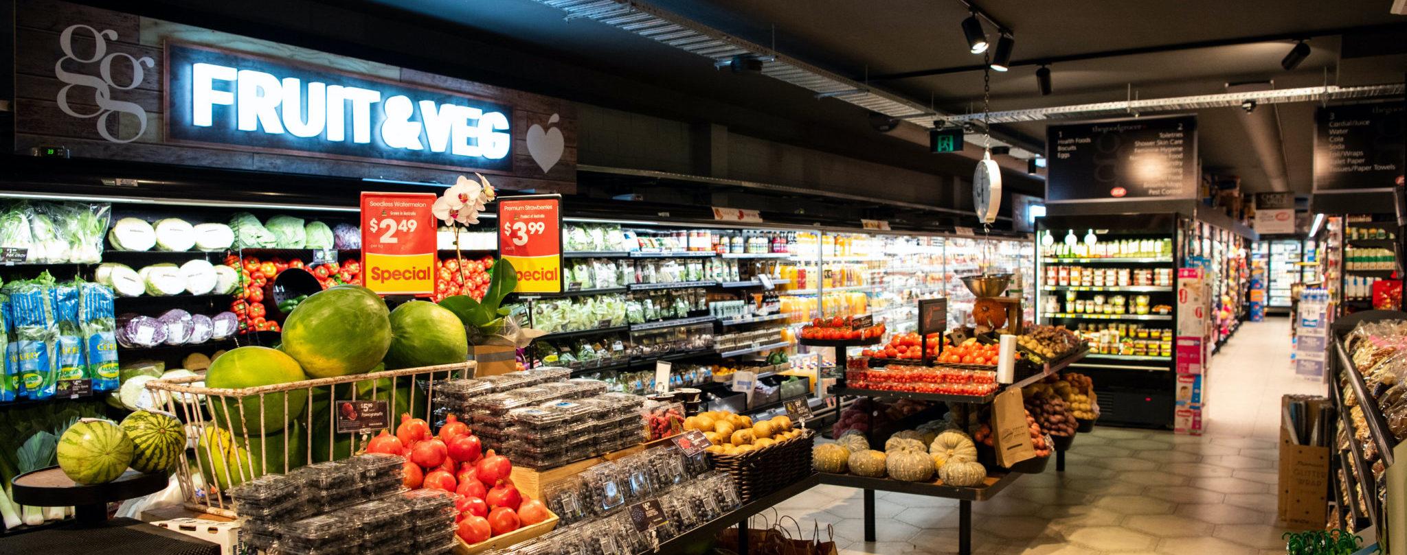
The Good Grocer brand is an independent-owned local supermarket in Perth that started in 2009 and has rapidly expanded from one to eleven stores in WA, partnering with IGA. Due to its rapid growth, the brand wants to create an online grocery shopping app to accommodate the demand and further drive sales, memberships, and brand recognition. The brand wants to focus on providing exceptional service to users beyond in-store shopping to stand out.
Having an online business presence is necessary nowadays. However, Australia's grocery industry is dominated by Woolworths, Coles, and Aldi, and having their apps was financially and strategically viable for them. But for a state-wide brand, it proves to be a tall task.
How might we leverage their smaller reach to provide innovative features to help customers simplify their grocery shopping activities?
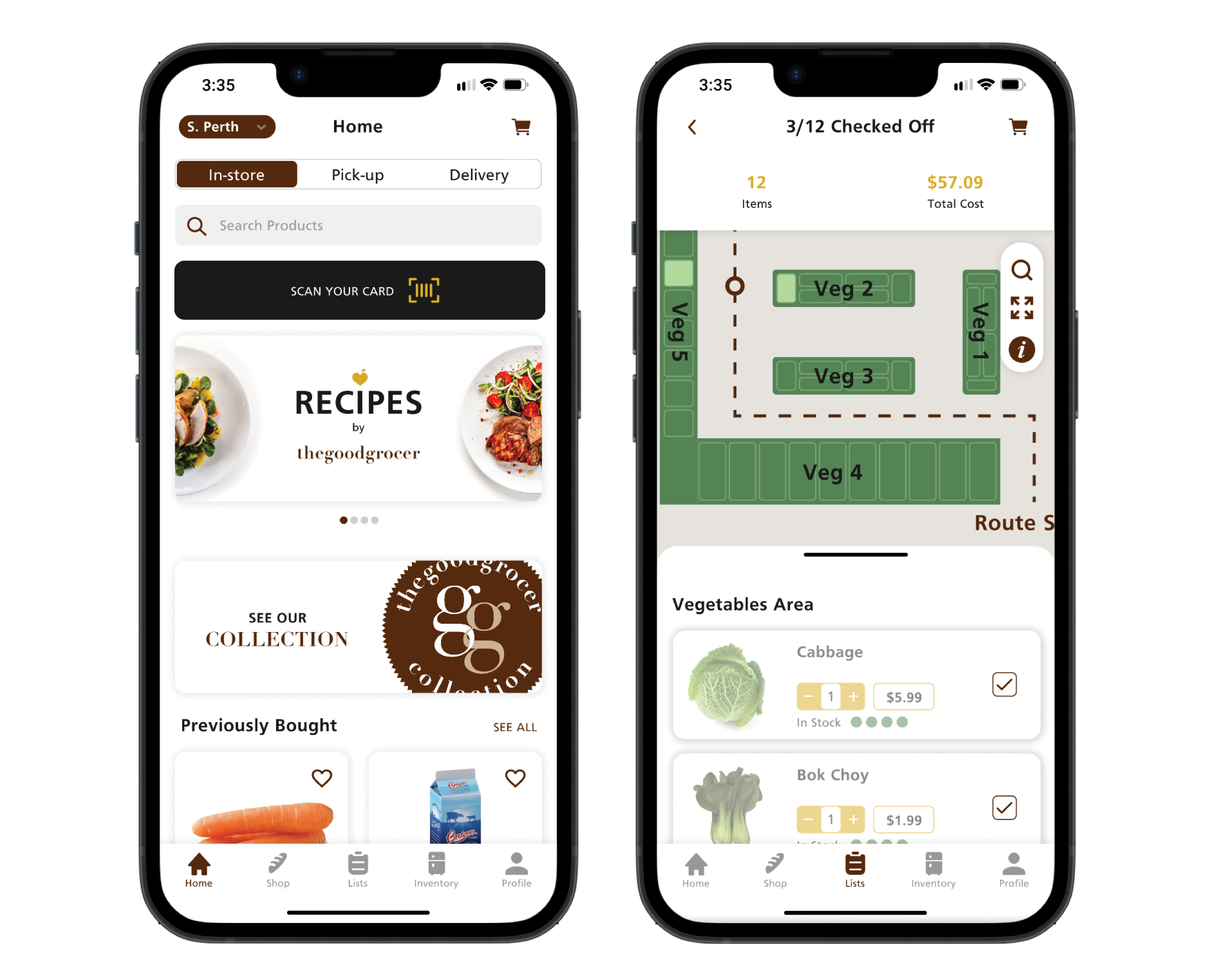
The Good Grocer provides three relevant features that work together to relieve shoppers of the stress that comes with planning and conducting grocery activities: a digital inventory of your purchased items with expiry dates, which is then utilised to provide recipes based on what you have in your inventory, and lastly, add those missing ingredients to your list which users can use our interactive store map for efficient navigation around their chosen store.
RESEARCH
The Good Grocer has nine stores in Perth. As a resident, I noticed something about the suburbs: they are in the more expensive suburbs. I needed to validate that assumption and the age demographic and household arrangements.

These are our findings:
While it is safe to say most of the residents in these suburbs are financially stable, helping customers save money would strengthen loyalty and attract more possible shoppers.
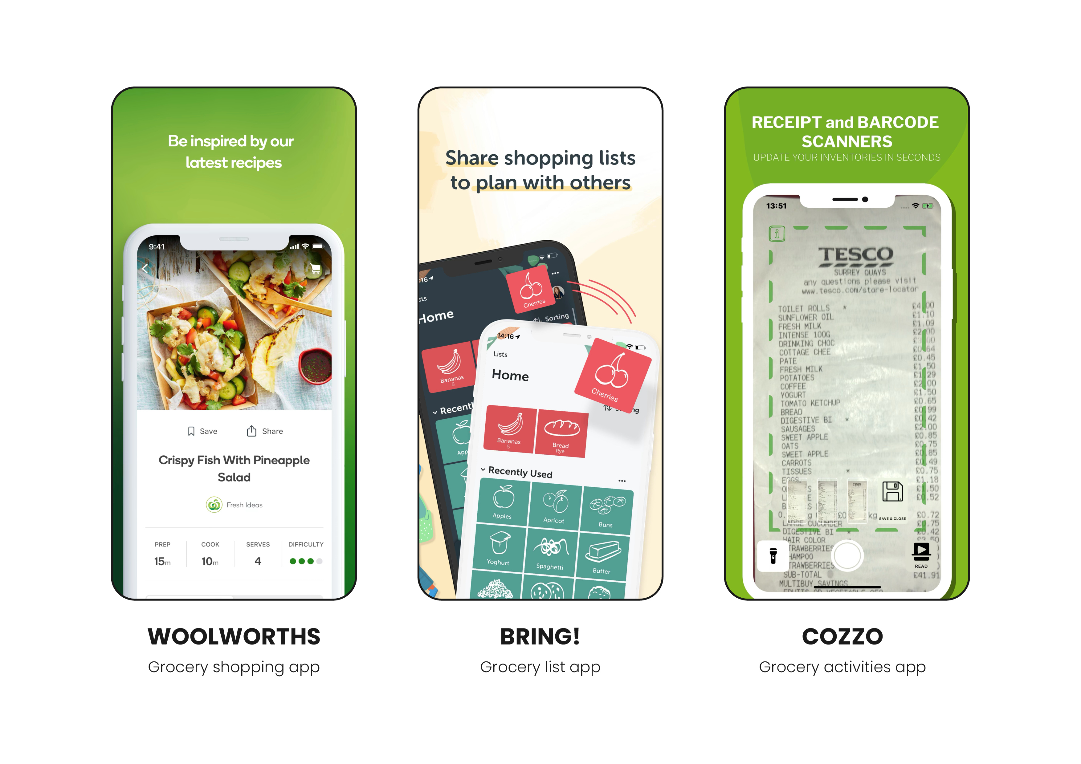
While it seems like the bigger grocery brands have figured out what the shoppers need, there is a reason why grocery list apps still exist. So, instead of looking at what they're not doing, I first analysed what works and what doesn't on these three apps.
Then, I needed to craft effective questions to help me gather relevant insights. While conducting user interviews would have been a good choice, time was limited, and I thought grocery shopping is something everyone does at a certain point in life. So, a survey was my best choice to gather varied insights.
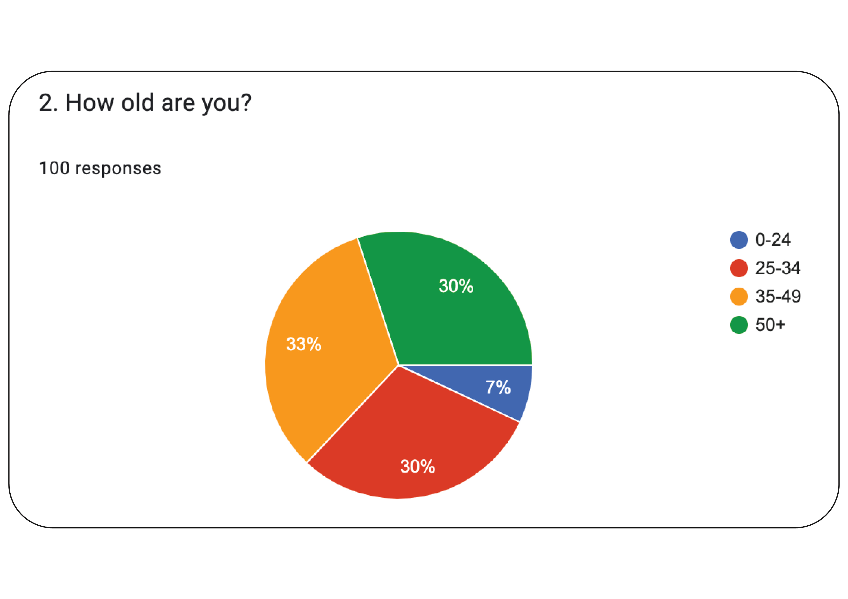
Ten quantitative and five qualitative questions make up the survey, posted on two relevant subreddits, r/foodhacks and r/RedditForGrownups, with 100 participants completing the survey.
While the quantitative questions gave me an idea of the demographic and shopping behaviours of the participants, the qualitative questions go to the specifics and whys, which I managed to distil into three goals:
I then crafted a persona for each goal, informed by our demographic research and survey insights.
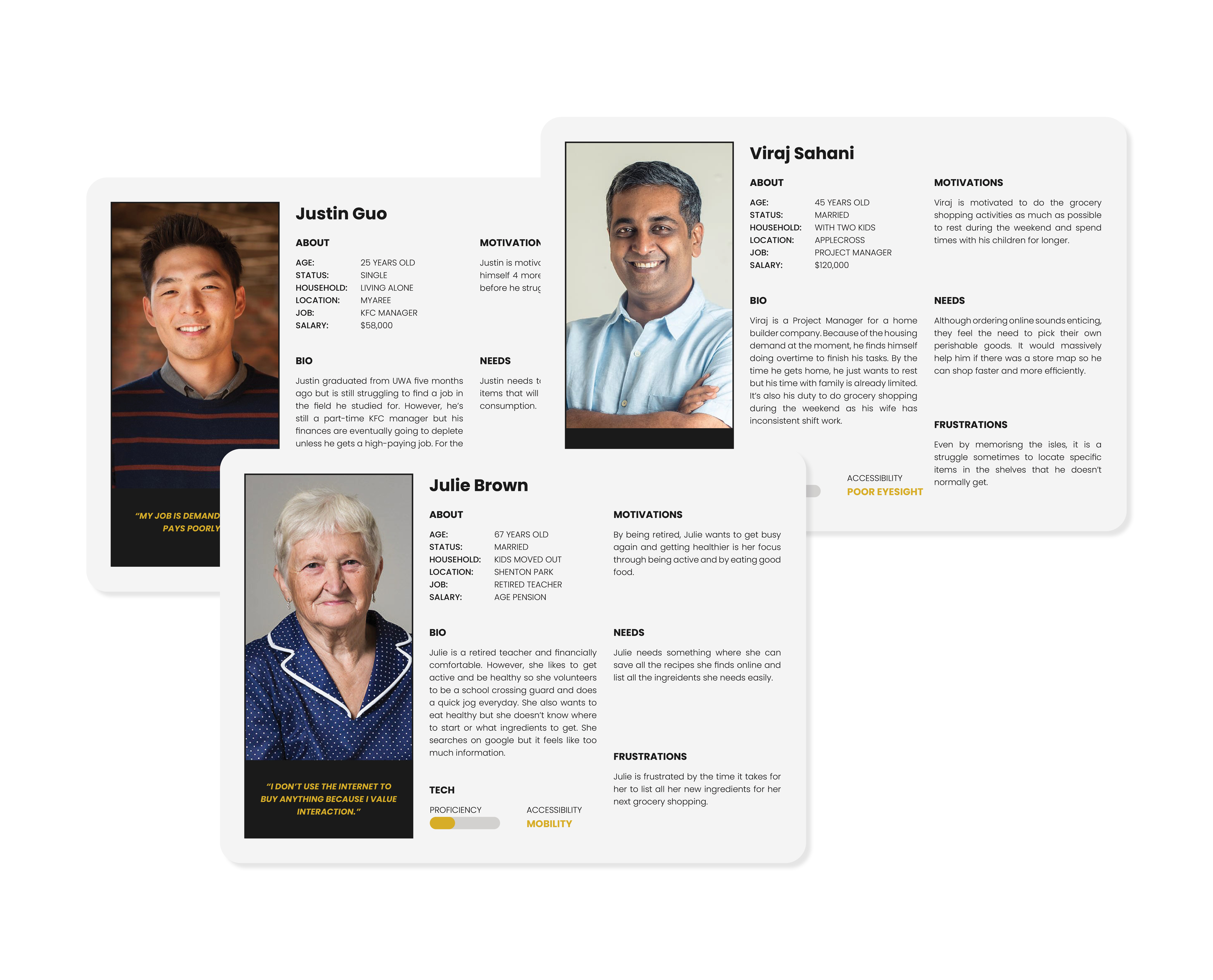
A recent UWA graduate and a part-time KFC manager struggling to stay afloat financially due to rising costs and a tough job market.
A dad and a Project Manager with long hours of work who does grocery weekly but wants to do it quickly to spend more time with his children.
A retired teacher who aims to get healthy by trying out new healthy recipes but finds it overwhelming to do the research.
With these findings in mind, what solutions can we offer that cover the gap in the market?
DESIGN
A well-thought-out planning must be conducted first because of the nature of a grocery app where the user is taking in a lot of information. The design of lists alone, from shopping lists to recipes, was challenging as it meant knowing the level of information and control that must be provided for each item.
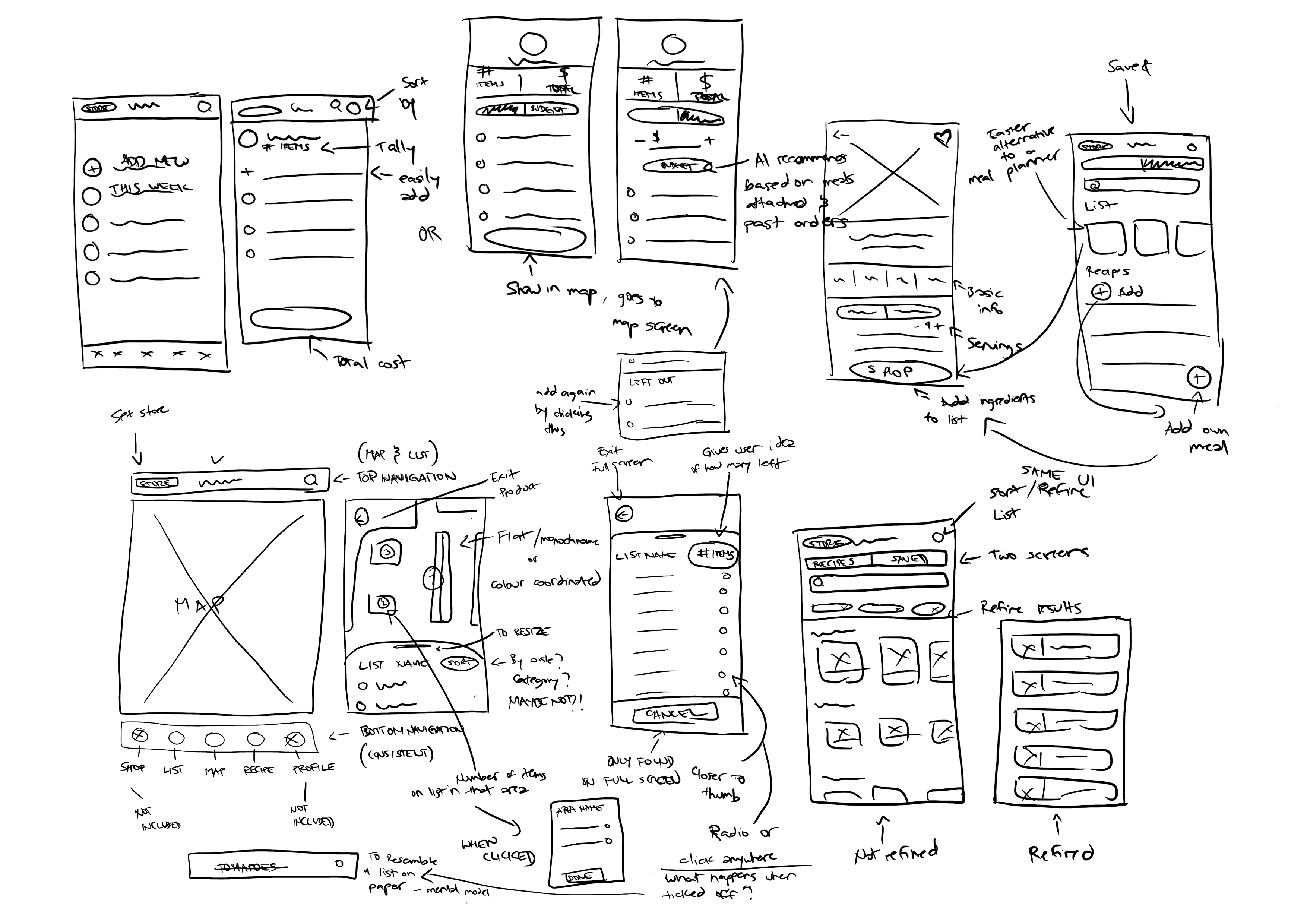
My ideas were in-app inventory, recipes based on inventory, and an interactive store map, along with the integration of AI to achieve more accuracy and personalisation. However, because the idea of AI was complex, I focused too much on the functionalities that they ended up poorly realised into mock-ups or, should I say, wireframes.
Luckily, the constructive feedback I received in class guided my design process in the right direction, and I could not wait to get more, which resulted in more iterations than planned. But a necessary scope creep.
I had two more feedback sessions with them for refinement before I conducted AB testing to fully optimise the user flows and hear insights from non-design background people.
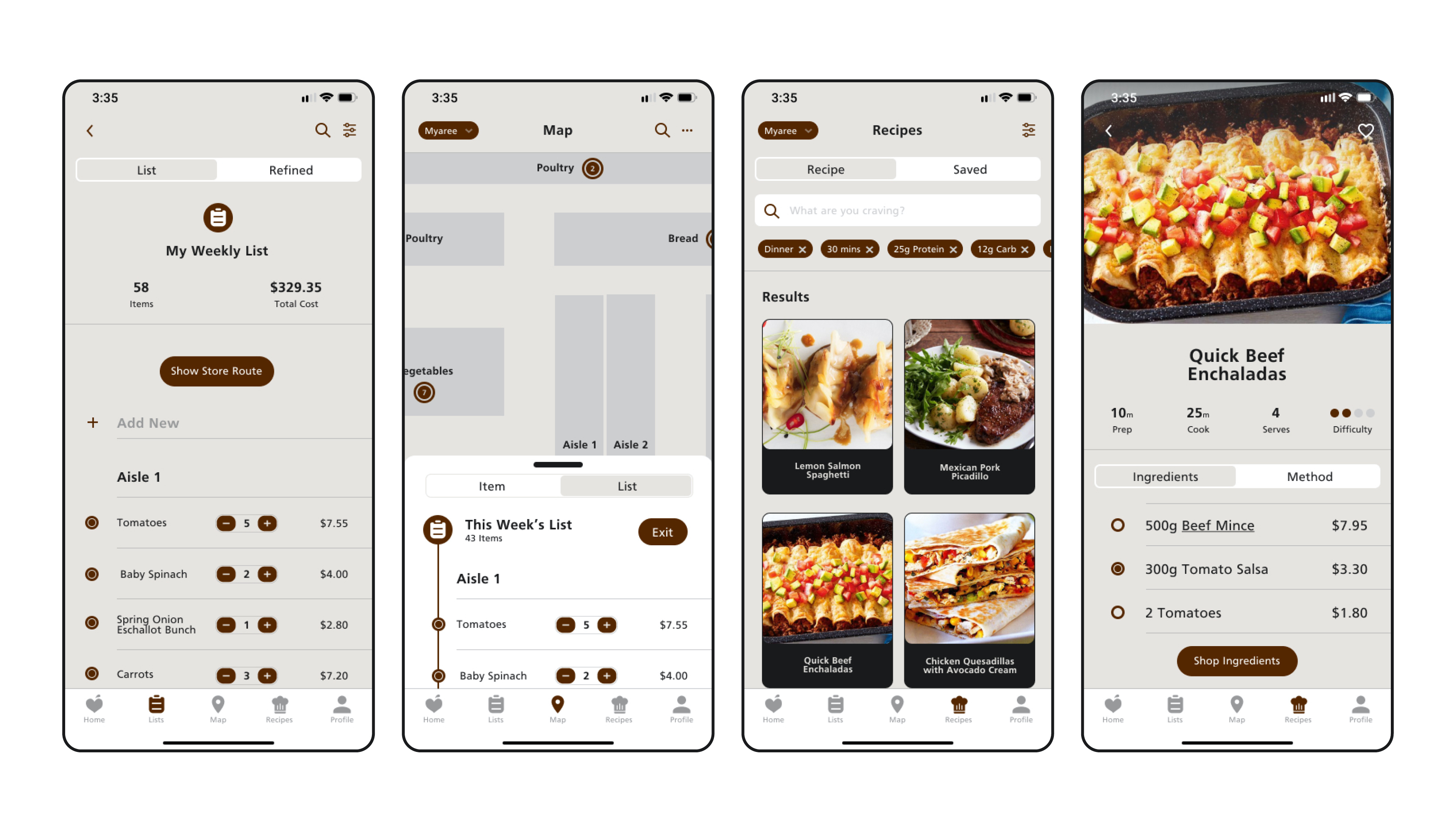
By scanning their now in-app membership card at the counter, the items on your receipt are transferred to your app and categorised automatically, along with expiry dates, to use your inventory effectively and minimise waste.
To minimise waste more effectively, we are utilising the inventory feature to add a unique category to our recipe page called 'Use My Inventory'. With this, users can look at recipes for which they have the ingredients or simply add missing ingredients to their shopping list.
Once the user has refined their weekly shopping list using the two previous features, it's time to put your hands on the cart as it will be a quick grocery trip by using our interactive store map based on your list to map out the location of all items and provide an efficient route.
My The Good Grocer UX project was an example of having somewhat sound research and informed solutions poorly conveyed in design initially. I was focused on the functionalities by embedding AI into my features, so the visual design suffered. However, due to the guidance of my tutor and design cohort peers, I got rid of AI and focused on the features' information and interface design to leverage their potential positive impacts on shoppers.