UX & UI Design · 2022 · Client Work
Role:
UX & UI Designer
Web Developer
Tools:
Figma
HTML | CSS | JavaScript
OVERVIEW
The Dwellingup Discovery Forest was established by The Dwellingup Protection Group in 2016 to advocate for the preservation of an area threatened by mining. In 2022, I volunteered with a group of design students from Curtin University to support their campaign through design. One of our main objectives was to create a more user-friendly and visually appealing map of the forest, that was both simple and informative, as well as interactive.
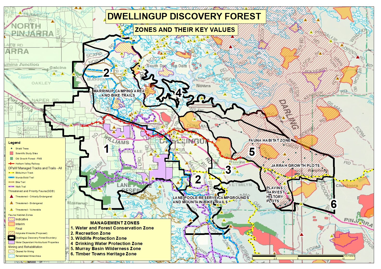
The original map of the Dwellingup Discovery Forest effectively presents an accurate overview of the six zones within the forest. However, it lacks user-friendliness and presents challenges for users in accessing and comprehending the information. The excessive use of lines, shapes, and colours creates visual clutter and overwhelms users, hindering their ability to effectively gather information from the legends.
How might we redesign the map to enable users to gather information about the forest's zones and legends more efficiently?
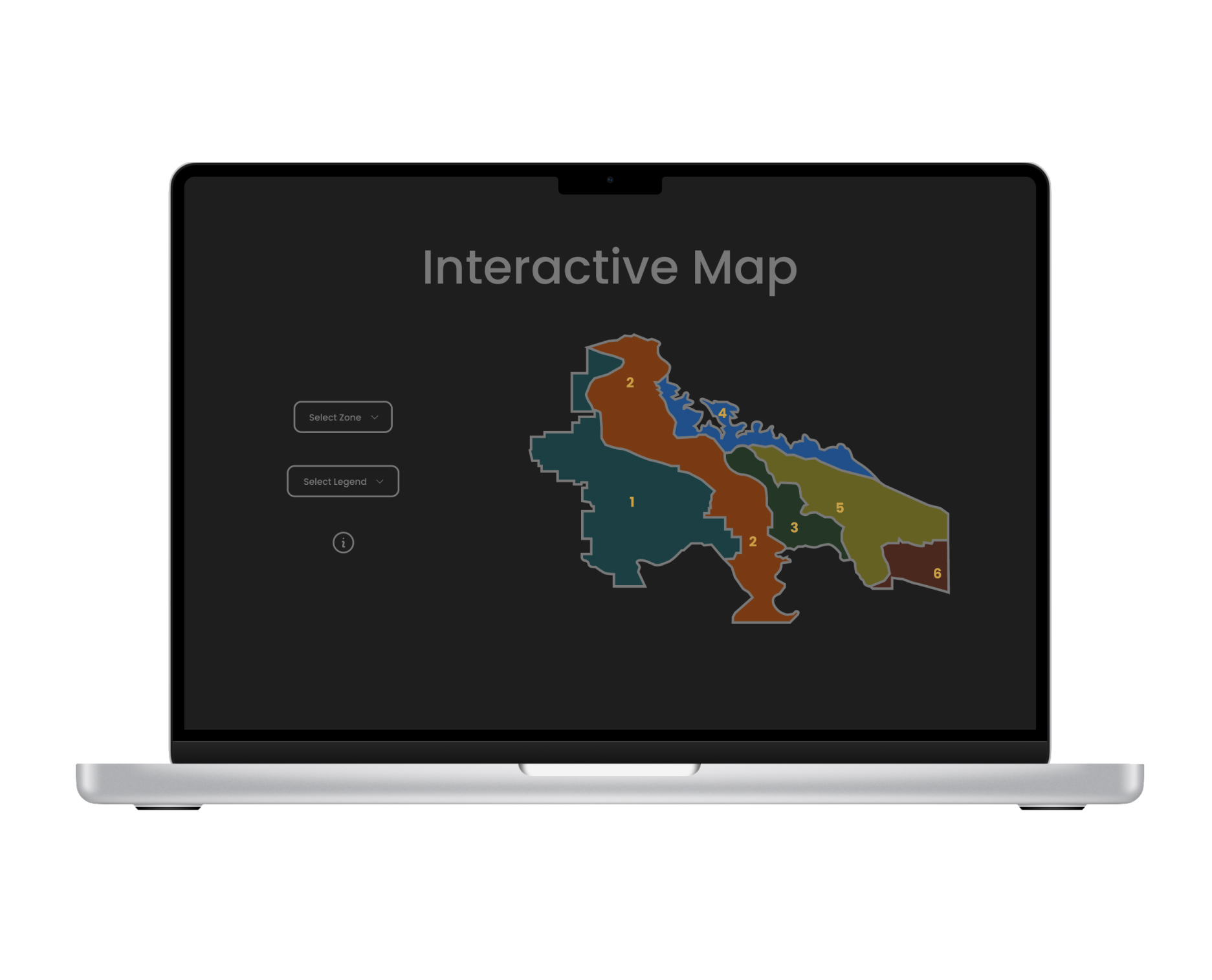
To supplement the original map, I redesigned a simplified layout that caters to a wide age group. The interactive digital map utilises dropdown features for selectable zones and legends to avoid visual clutter. It also allows users to access information about selected items, helping them learn about Dwellingup Discovery Forest. This supports the environmental organization's goal of shedding light on Alcoa's ongoing mining expansion proposal.
RESEARCH
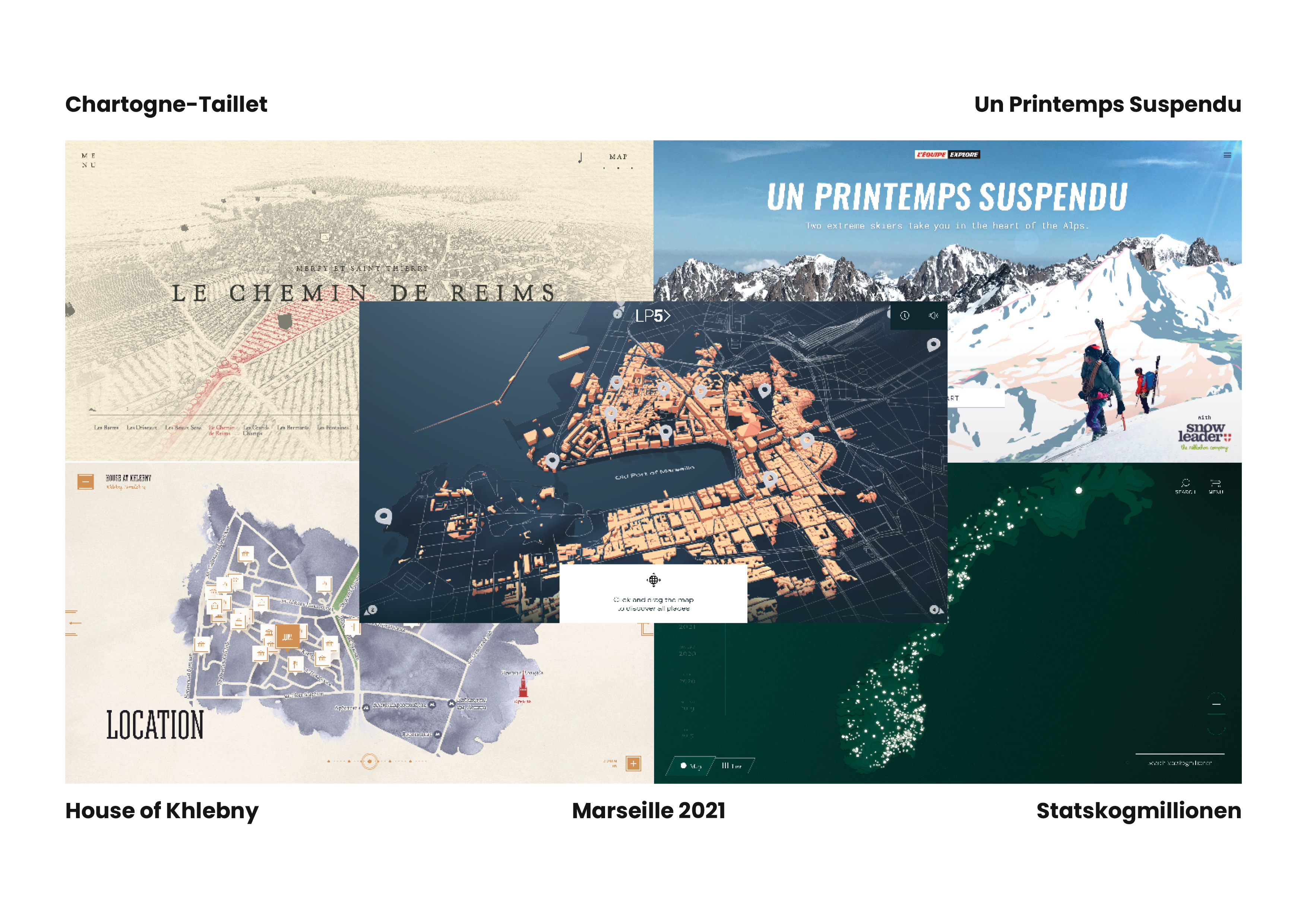
To set the right expectations, I needed to be honest with myself first. I do want to create an interactive map, but only appropriate to my skill level and enough to fit in Dwellingup Discovery Forest's web design. So, I explored five websites that have different approaches to their interactive maps.
The maps were either 2D or 3D. The art styles range from sketches, watercolour paint, minimalist, modern, and even video storytelling. Although I already knew I was going to choose the 2D route, the 3D maps were powerful in that I was more immersed in the story because of the enhanced storytelling through 3D.
Now that I have taken inspiration from others, it's time to imagine the map further with the right design trends appropriate to the brand.
This is a no-brainer since we're trying to re-design their cluttered map to look easier to the eyes. Clean does not necessarily mean simple, but the layout is arranged in a way that works.
An interactive map has many possibilities and might require using the whole screen if needed. But, if there are main buttons, we can increase the design's usability by being thumb-friendly.
Effective use of white space must be achieved to enhance information design if we want it to tell a story, working with a clean design not to overwhelm users.
These personas were developed using relevant insights and context to represent distinct individuals and their specific perspectives and concerns.
After analysing the existing map, I understood why the map was the way it was. It tried to be as informative as possible, showing all that is important to the forest map, limited by a static image.
While the static design could still be improved, the website is taking advantage of the possibilities of having a map designed to be on the web because it can be interacted with. And just like the maps I analysed, they didn't show everything all at once.
Because this was a coding unit, comprehensive user research was not needed, but from what we can tell from the advantages of a digital interactive map, I came up with three appropriate user goals:
The best possible scenario for this cause is to target all age groups so Perth residents can be made aware and spread the word because this has an effect not only on the Dwellingup residents but also on everyone.
A high school student and environmental activist dedicated to raising awareness about local environmental issues among her peers and the community.
A full-time university student who works at the Dwellingup Discovery Forest store on weekends to support himself. He is concerned about the declining number of visitors due to the negative impact of mining in the area.
A retired university tutor whose home and well-being are being negatively affected by the expansion of mining activities in his region.
DESIGN
I experimented with different ways to present the map, legends, and information within a
full viewport. The texts may be in a carousel, drawer, tooltip etc.
I knew I didn't have the capabilities to create a complex 3D model of the map, so perhaps
a zoom-in feature like on Google Maps would do.
I also brainstormed how maps will respond to the legends and zones selected using colours without taking away from accessibility.
The information is on the left side, along with dot navigation. On the right side is the responsive map. Each zone is allocated a certain colour based on what the zone is for. For example, zone 1 is set to teal for the water and forest conservation zone.
EVALUATE
After this assessment, I started developing the single-page website for this map.
I needed to address the missing legends because I did not have ideas for including
everything in one viewport.
I made the background dark so the colours could have more impact on the visual cues
it is giving. However, the buttons on the left side only change the map based on what
is selected. The selections also do not include the zones anymore.
My limited knowledge of JavaScript was detrimental to my vision for this feature.
However, a few months after the semester finished, ChatGPT came out. After testing out its capabilities,
I knew I had to give this project another try.
While the original map is detailed and informative, it can be overwhelming due to the clash of colors and shapes in the map. Our new design prioritises simplicity to create a more user-friendly experience. It's important to note that the new design is intended to complement the existing map rather than replace it.
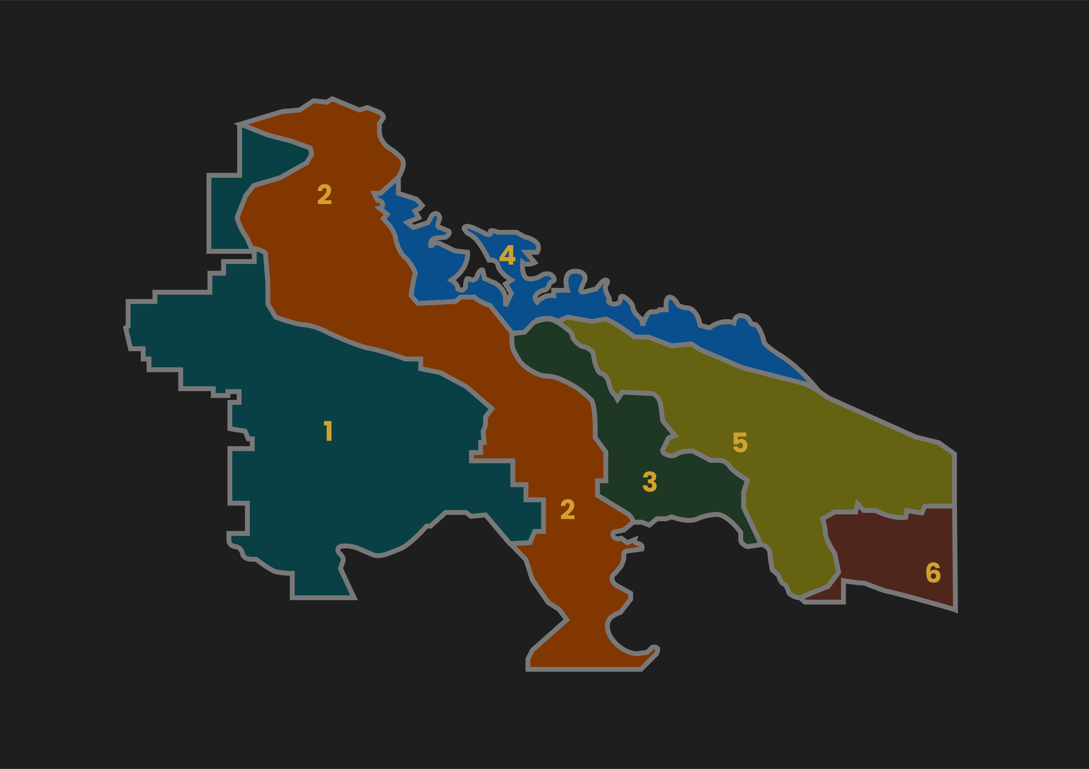
Our interactive map includes over 120 specific combinations, providing users with a comprehensive view of the protected zones and their associated legends. With eight zone options and fifteen legend variations, users can easily and clearly visualize the designated areas.
The client wanted more than just a simple map, they wanted it to be informative too. One key tool I used was Shoelace's dialog component, which helped contain detailed information about selected items. By implementing three buttons, the layout remained clean and user-friendly, enhancing the overall experience.
I had a vision for this project that I could not quite get right during the semester due to my limited knowledge of JavaScript. But the help of ChatGPT opened my eyes to learning more about coding so it doesn't subconsciously limit my visions for future projects. I've also learned to view these AI tools not as a competition but as tools to expand my imagination of what I'm capable of coding.