UX & UI Design · 2023 · Client Work
Role:
UX & UI Designer
Illustrator
Web Developer
Tools:
Figma
Procreate
HTML | CSS | JavaScript
OVERVIEW
Sugar Artist, a Freo Markets-based bread store, excels in crafting "ensaymada", a beloved Filipino pastry featuring sweet yeast dough, sugar, and grated cheese. Within a year, the business has achieved financial success and gained a devoted following in Perth. To propel growth and optimize operations, establishing a showcase website for their existing and potential customers is now a priority.
While Sugar Artist has established a strong social media presence on Instagram, the absence of a dedicated store website limits their ability to expand their customer base, effectively promote their products, and optimize their operations.
How might we create a visually appealing and user-friendly store website for Sugar Artist that effectively showcases their branding, products, and facilitates seamless online ordering?
The proposed website aims to enhance the branding and identity of Sugar Artist by leveraging impactful copywriting, compelling storytelling, and visually engaging elements. An intuitive layout ensures easy navigation, leading customers seamlessly to the main checkout website with the always-visible "shop" button in the header.
RESEARCH
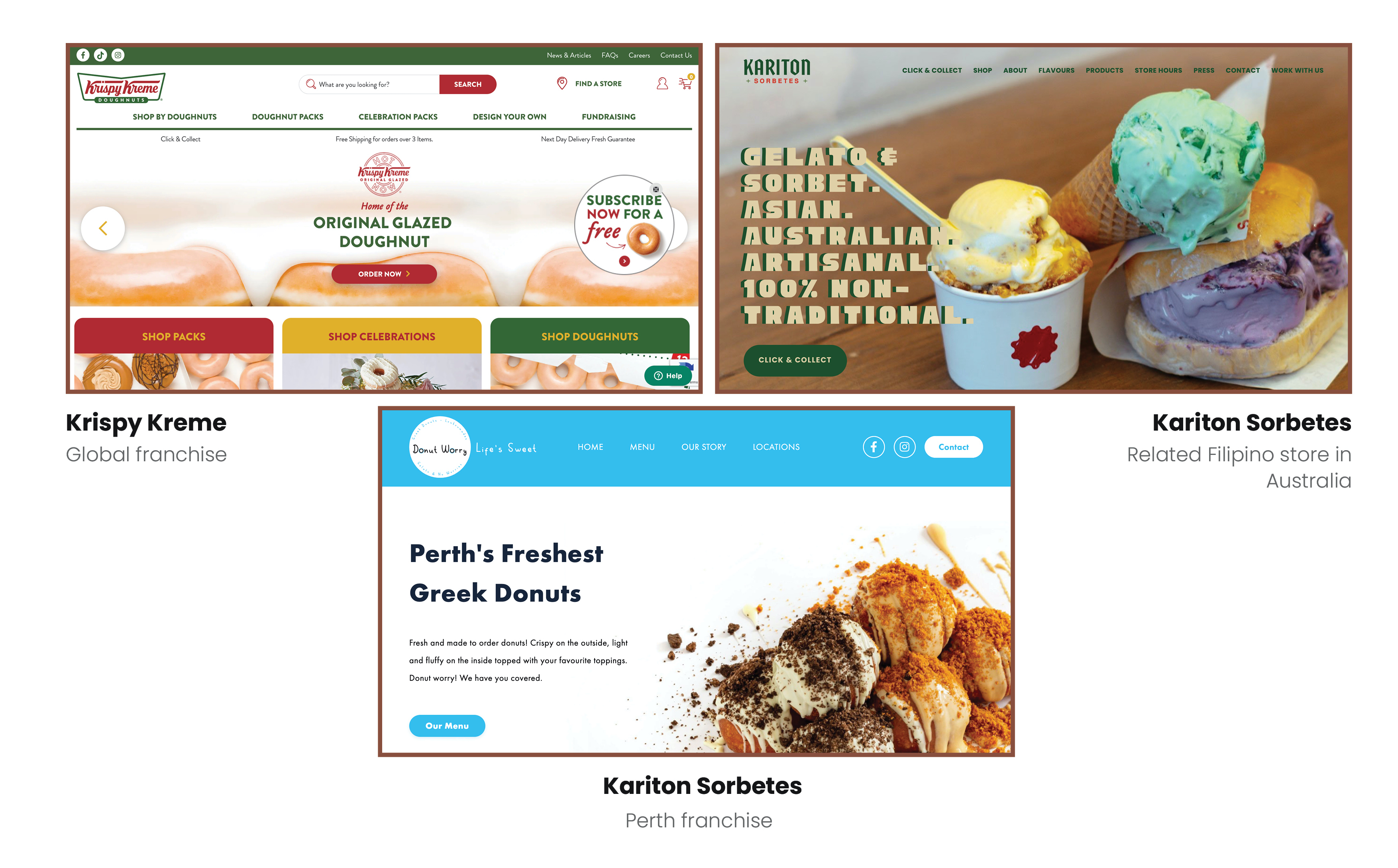
This project was from a code-heavy unit, so proper user research was omitted. However, competitive analysis on relevant websites was conducted. While I usually try to see what I can do differently, my goal is to take inspiration from successful websites, as the project will focus on the impact of visuals.
While I tried to look for similarities like how each homepage had a button that leads the process of buying, the three websites I chose proved to have design trends to offer in their own ways.
As fellow Filipinos, there was an inherent trust already built between each other, and they were kind enough to give me access to their branding guide containing all the information I needed to know about where they wanted to take the brand.
What user goals come with developing a website for a business?
One of the best things about Perth is the availability of a variety of cuisines from different cultures. While Filipino food has a smaller scope compared to other Asian cuisines, Sugar Artist's strategic position in Freo Markets opens them up to people from different walks of life.

A Filipino-origin student in Australia, eager to experience authentic Filipino pastries for a cultural connection.
A Filipino baker turned factory worker in Australia missing the taste of home and seeking a bakery that offers traditional flavours and quality craftsmanship.
An adventurous tourist exploring Freo Markets, open to trying diverse culinary experiences like Filipino pastries.
A nurse working with Filipino colleagues, curious about Filipino culture and keen to explore it further through authentic pastries.
DESIGN
I experimented with different header layouts and made sure the hero page effectively showcased what Sugar Artist is about.
The effectiveness of the menu layout is also important in the user's decision-making. There are only six products, but they can be arranged in different packs, so I needed to ensure users could identify and differentiate those options.
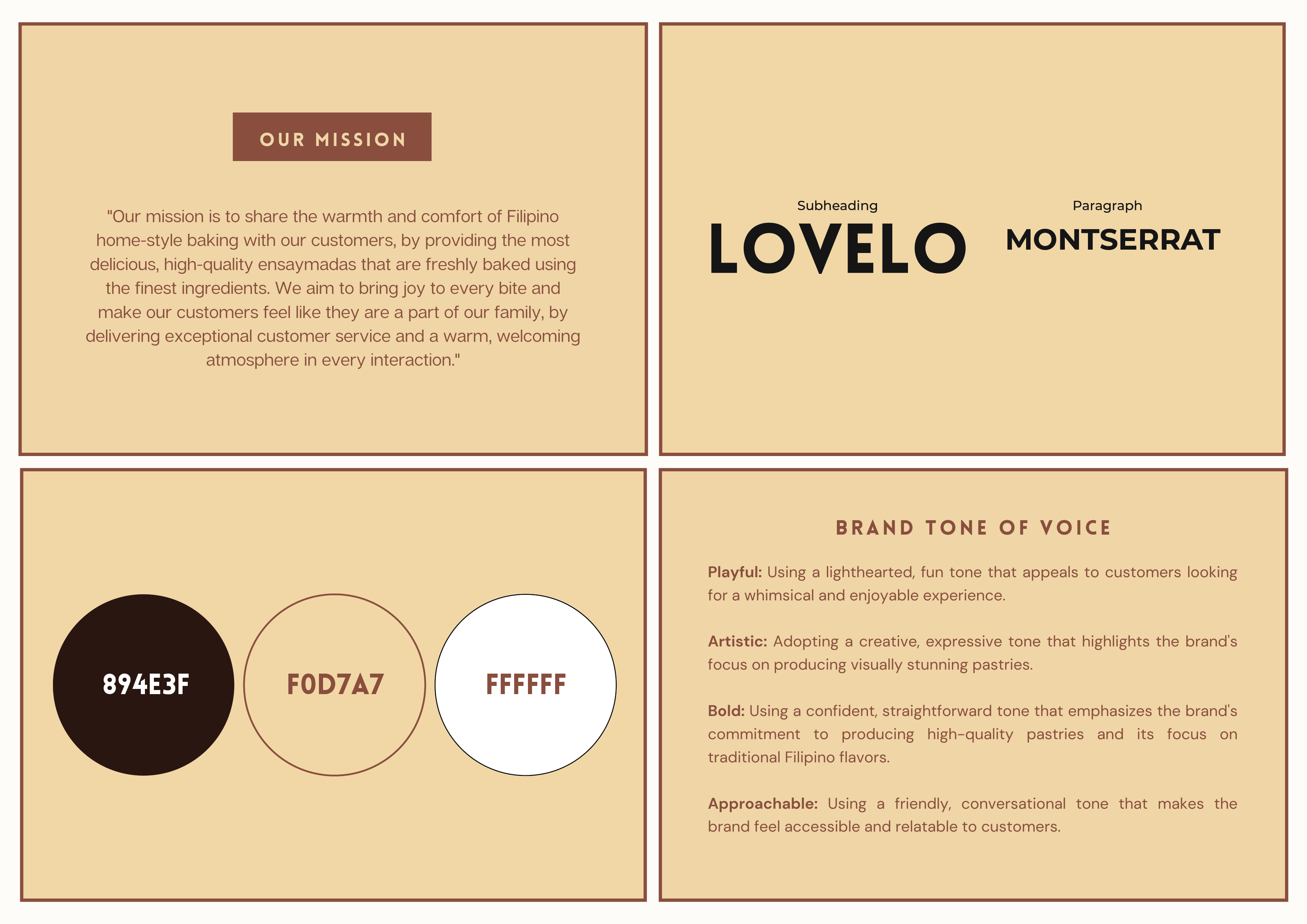
Regardless of the creative freedom the client gave me, I knew the branding must
be prioritised, so I ensured the colour palette and typefaces were consistent throughout.
After receiving two sample websites from the client for inspiration, I carefully analysed
their similarities and style during a productive brainstorming session. Using these insights,
I designed a mockup, ensuring it reflects the best elements of both samples and meets the client's expectations.
Before developing, I clarified the project scope with my client, and he informed me
that they have a separate website for checkout and payment from Square, so I just
needed to worry about making the website look nice and professional.
I also realised the images didn't work well against the dark brown background
during development, so I swapped them with light brown. I also found the hero image on
the landing page to be weak, as it lacked a unique and compelling representation of the business. My idea required
my unrefined illustration skills just so my vision was satisfied.
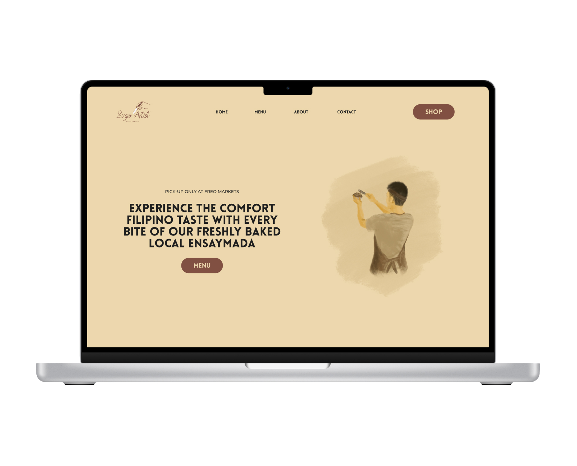
A compelling hero page plays a pivotal role in establishing the website's overall tone and showcasing essential aspects of the brand identity. Drawing inspiration from its name, the hero image depicts a skillful individual crafting ensaymada, exuding an artistic flair and unfiltered passion for baking. Accompanied by a comforting text, both Filipinos and non-Filipinos can vividly envision the idea presented.
While Sugar Artist's menu may not be extensive, careful attention is given to its layout to ensure effortless navigation and clear decision-making for users. Product descriptions are conveniently presented below each item, with an additional option to request catering services, providing a comprehensive experience for users.
To enhance the appeal of a small website, incorporating animations into the layout cleverly conceal the website's compact size and infuses an element of excitement and delight. Users are greeted with an engaging visual experience that leaves a lasting impression of the brand, complementing the effectiveness of the captivating hero page.
By encountering a situation with my client where the scope was misunderstood, I learned the importance of maintaining consistent and comprehensive communication with the owner and adapting to changing situations easily. The project also opened my eyes to the benefits of networking as I met the client in a class, and when he mentioned his business and needs, I took the opportunity.